

Introduction: The Color Consistency Challenge in Clothing Packaging
Have you ever opened a new shipment of clothing packaging only to notice something unsettling? The colors look slightly, sometimes dramatically different from your last order. Perhaps that elegant purple logo now appears more magenta, or the soft pink background has shifted toward orange. You’re not imagining this, and you’re not alone.
Color inconsistency between packaging batches is one of the most common complaints in the printing industry. A staggering number of fashion and apparel brands experience this issue, and the root causes are often misunderstood or overlooked until a disaster lands on your loading dock.
This comprehensive guide breaks down exactly why packaging colors change between orders, what industry standards define “acceptable” variation, and—most importantly—how professional color management systems protect your brand from costly inconsistencies.
Manufacturer’s Note: While absolute zero-deviation in color is physically impossible due to substrate and ink variables, minimizing that gap to an industry-leading tolerance is the standard we set for our Custom Clothing Packaging solutions.
The Reality of Print Color Variation
Before diving into causes, let’s establish what you’re likely experiencing. According to industry standards, most printing processes accept a color deviation of approximately ±10% as normal variation. However, “normal” doesn’t mean “acceptable for your brand.”
Color professionals measure variation using Delta E (ΔE), a standardized metric that quantifies the difference between two colors. Here’s the practical breakdown:
| Delta E (ΔE) Value | Visual Perception | Industry Application | Brand Status |
|---|---|---|---|
| ΔE ≤ 1.0 | Imperceptible to the human eye. | Laboratory & Scientific research. | PERFECT |
| ΔE 1.1 - 2.0 | Perceptible only to trained experts. | High-End Brand Standard. | PREMIUM |
| ΔE 2.1 - 3.5 | Noticeable to untrained observers. | Commercial print (Acceptable). | CAUTION |
| ΔE > 5.0 | Obvious color difference. | Rejectable production. | CRITICAL |
Maintaining consistency across consumer packaged goods (CPG) requires more than just a visual check. As color experts at X-Rite point out, achieving color accuracy in CPG packaging involves a systematic approach to measurement and specification.
For brand packaging where visual consistency builds recognition and trust, Delta E values above 3 can damage your brand’s perceived quality and customer confidence 108. Research shows that 81% of consumers are more likely to remember a brand by its colors than its name, making color consistency a critical brand asset, not just a production concern.
6 Reasons Your Packaging Colors Change Between Orders
Understanding the root causes of color variation empowers you to ask the right questions and demand proper solutions from your packaging suppliers.
1. The CMYK "Butterfly Effect": How Four-Color Printing Amplifies Small Errors
What is CMYK printing? CMYK (Cyan, Magenta, Yellow, and Key/Black) is a subtractive color model used in offset and digital printing. By layering these four ink colors in varying percentages, printers can create millions of color combinations. While CMYK can simulate many colors, it has inherent limitations compared to pre-mixed inks. For a deeper technical breakdown, you can explore Pantone’s official guide on Spot vs. Process color.
The challenge? Each color requires precise control. Even a 2% deviation in ink density can shift the final color noticeably
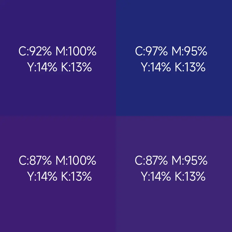
The Purple Problem: Consider Pantone 2685C, a royal purple that’s popular in fashion and beauty packaging. This color requires a delicate balance of magenta and cyan inks—typically around 95% magenta and 60% cyan. A 5% increase in magenta transforms royal purple into deep violet, while a 5% decrease renders it a dull gray-purple. This is why some brands describe their purple as “totally different” between batches despite using identical specifications.
Industry research shows that “most spot colors found in the Pantone Formula Guide can be matched using CMYK within 5 Delta E—but many fall outside this range, with some exceeding 10 Delta E when converted”. For sensitive colors like purples, oranges, and certain greens, CMYK conversion is inherently unstable across print runs.
Why this matters for clothing packaging: Fashion brands often rely on brand colors that fall in problematic CMYK ranges. Without proper spot color specification (discussed later), each order becomes a gamble on color reproduction.
2. The "Same Name, Different Results" Problem: How Substrate Absorption Changes Everything
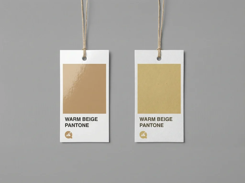
The same Pantone ink (Warm Beige) printed on two different substrates. The porous white kraft paper (right) absorbed more ink and shifted yellower compared to the coated paper (left), illustrating the substrate’s role in color matching challenges.
When you specify “white packaging,” you’re not being as specific as you think. Multiple paper types can all appear “white” while producing dramatically different print results, especially when the same paper name masks completely different material properties.
Real Case Study: The White Kraft Absorption Challenge
One clothing brand ordered their signature cream-colored packaging using Pantone 7520C (a warm beige). The first batch on white kraft looked perfect. Three months later, they reordered the same specification. But the new shipment appeared noticeably more yellow.
Our investigation revealed the root cause: while both orders used “white kraft,” the second supplier’s white kraft had higher fiber porosity. The more absorptive surface pulled more yellow pigment deeper into the paper, reducing surface reflection and creating a warmer, more yellow appearance. To achieve the same visual result, our press operators had to reduce yellow ink by approximately 8% and add a touch of optical brightener.
This case illustrates a critical truth: “Pantone numbers are a starting point, not an ending point.” The same Pantone color requires different “visual recipes” depending on the actual substrate.
The Paper Problem Explained:
| Material Type | Brightness Index | Ink Absorption | Color Vibrancy | Strategic Note (SEO Focus) |
|---|---|---|---|---|
| Coated Art Paper Copperplate/Glossy Paper | 90% - 95% | Low (Surface Curing) | Superior / High Saturation | Best for luxury fashion retail with vivid imagery. |
| White Kraft Paper Natural Wood Fiber | 75% - 85% | High (Deep Penetration) | Muted / Matte Finish | Risk of batch variation due to high fiber porosity. |
| White Board (CCNB) Coated Duplex Board | 80% - 90% | Medium - High | Moderate / Consistent | Commonly used for folding cartons and mailer boxes. |
Paper brightness significantly impacts color perception. A 90% brightness paper reflects more light, making colors appear more vibrant. Dropping to 80% brightness can reduce color saturation by 15-20%, making your brand colors appear muted and inconsistent across substrates.
The physical properties of the paper itself—its fiber density and surface coating—dictate how much ink is absorbed. If you are unsure which material best suits your brand’s color requirements, refer to our comprehensive Paper Bag GSM and thickness guide for technical specifications.
Research confirms: “Two prints with the same CMYK numbers can look different because the substrate and surface change how ink sits and how light reflects”. This is why physical proofing on actual materials is essential for color-critical work.
This is also why luxury paper bags with logo should be checked by paper type, surface finish, and print method, because the same Pantone or CMYK color can look different on coated paper, textured paper, matte lamination, or gloss lamination.
3. The Invisible Culprit: Temperature and Humidity Effects
Even with identical materials, identical equipment, and identical ink formulations, environmental conditions can create visible color differences between print runs.
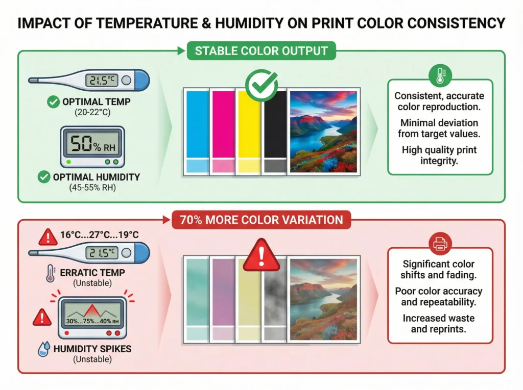
Comparison of color output under stable vs. erratic print environments. The data on the red panel shows how unstable humidity (e.g., shifts from 30% to 75%) causes fiber swelling and 70% more color fluctuation.
The Science of Humidity:
Industry standards specify that offset printing should maintain relative humidity between 45-55%, with digital printing preferring 50-55% . Heidelberg, a leading printing equipment manufacturer, recommends storage conditions of 50% ± 5% relative humidity and temperatures between 20-22°C year-round.
Here’s what happens when these conditions vary:
Industry standards recommend 45-55% Humidity and 20-22°C.
Select a level to see how it impacts your packaging quality:
COLOR
Heidelberg Standard Met
- Paper fibers remain dimensionally stable
- Optimal ink transfer and absorption
- No static interference or ink mottling
- Guaranteed Delta E < 2.0
The Science of Temperature:
Temperature affects ink viscosity, how fluid or thick the ink behaves. According to industry research: “High temperatures can cause inks to thin, leading to excessive flow and color shifts, while low temperatures can make inks too viscous, affecting transfer and coverage” .
Most critically, temperature control can reduce up to 70% of color variation in print processes. This single factor might be the difference between consistent batches and frustrating deviations.
For Clothing Packaging: If your packaging is stored in a humid warehouse before reaching customers, colors can continue to shift post-production. Climate control throughout the supply chain matters.
4. Missing the "Standard Answer": Why Digital Proofs Don't Match Offset Production
Many brands make a critical mistake when starting their packaging journey: they rely on digital proofs from their supplier rather than establishing standardized color references based on actual offset printing conditions.
The Digital vs. Offset Color Gap
Digital printing and offset printing are fundamentally different processes that produce color differently:
| Aspect | Digital Proofing | Offset Printing |
|---|---|---|
| Color Method | Software simulation | Physical ink mixing |
| Pantone Match | Approximation algorithm | Actual Pantone ink |
| Material Adaptation | Limited | Full adjustment capability |
| Consistency | Variable | Highly repeatable |
* Why it matters: Digital proofs predict, but Offset printing produces reality.
Here’s a real scenario we encounter regularly: A fashion brand’s designer creates artwork on a calibrated monitor, approves a digital proof, and confirms production. When the offset-printed goods arrive, the brand manager notices the purple is deeper than expected. What happened?
The Technical Reality:
Digital proofing systems use software to simulate how colors will appear when printed. They cannot account for the specific absorption characteristics of your actual substrate, the precise ink formulation available at the print shop, or the exact press conditions on the day of production.
According to industry analysis: “CMYK breakdown colors, while more versatile for full-color printing, may not always accurately match the desired Pantone colour due to gamut limitations”. Digital proofs amplify this limitation because they’re adding another layer of approximation.
Delta E Reality Check:
- Digital proof vs. Pantone standard: ΔE 2.8 (looks very close on screen)
- Offset press vs. Pantone standard: ΔE 3.5 (actual achievable match)
- Digital proof vs. Offset result: ΔE 5.2 (significant visible difference!)
The Correct Workflow:
THE PROFESSIONAL COLOR LOCK PROTOCOL
5. Ink Batch Variations: The Unavoidable Natural Difference
Even the highest-quality inks from premium manufacturers contain inherent batch-to-batch variations in:
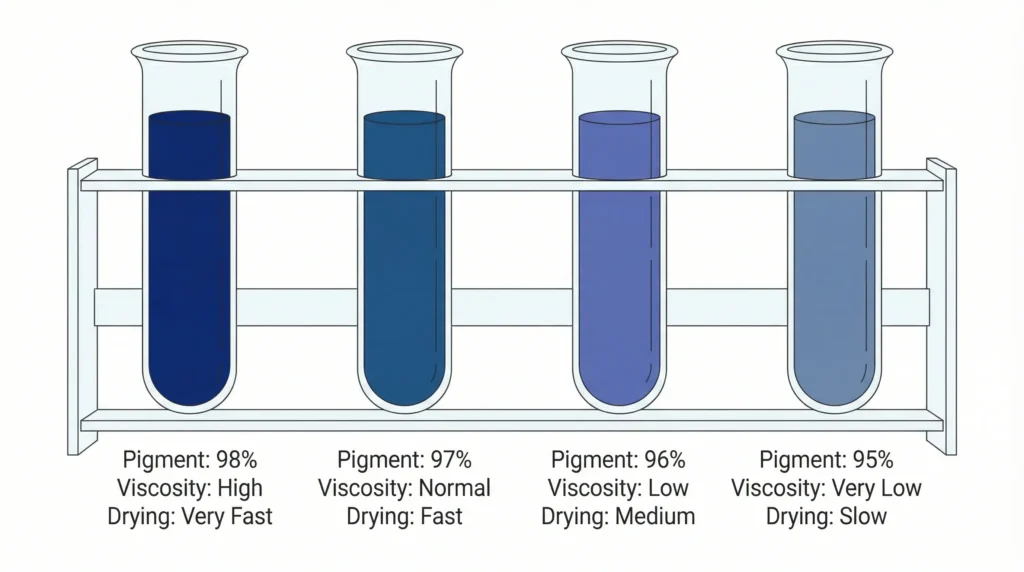
- Pigment concentration: Typically allowed a 3-5% tolerance range
- Viscosity: Affects ink transfer and coverage
- Drying speed: Influences final color development
- Particle size: Impacts color strength and gloss
These aren’t quality failures, they’re the natural result of manufacturing tolerances. Industry data shows that “even when coming from the same manufacturer, ink batches may vary in viscosity, drying speed, pigment concentration, or flow properties” .
What This Means Practically: When your supplier orders fresh ink for your job, they’re working with a batch that has slight differences from the previous batch. Without proper calibration and color measurement, these differences compound with other variables to create noticeable variation.
Storage Matters Too: Ink exposed to high temperatures during storage or shipping degrades faster, changing its color properties before it even reaches the press. Temperature-controlled supply chains preserve ink quality.
6. Equipment State Drift: The Hidden Degradation
Printing equipment requires regular maintenance, calibration, and consumable replacement. When these aren’t performed consistently, gradual drift occurs.
Common Equipment Issues Affecting Color:
| Critical Component | Degradation Symptom | Direct Color Impact | Risk Level |
|---|---|---|---|
| Rubber Blankets Offset Transfer Medium | Loss of elasticity / Pitting | Abnormal Dot Gain (Darker/Muddy colors) | HIGH |
| Ink Rollers Flow Control System | Surface hardening or glaze | Uneven ink distribution / Ghosting | MEDIUM |
| Impression Cylinders Pressure Precision | Misalignment or bearing wear | Registration errors & Color shifts | HIGH |
| Print Heads (Digital) Piezoelectric Nozzles | Clogging or electrical drift | Missing color channels / Banding | TECHNICAL |
Rubber blankets—the rubber surfaces that transfer ink in offset printing—lose elasticity over time and use. When they compress improperly, they increase “dot gain,” causing colors to appear darker and less detailed. Printers should replace blankets according to manufacturer schedules, but cost pressures sometimes lead to extended use.
The Maintenance Factor: Professional print shops follow strict preventive maintenance schedules. Budget operations may skip or delay maintenance to save costs. The result? The same job specification produces visibly different results as equipment condition changes over time.
Production planning tip:
Color confirmation can also affect your overall schedule. If artwork files, Pantone references, or sample approvals need to be revised, the custom packaging production timeline may be extended before mass production can begin.
Real Case Studies: When Color Consistency Goes Wrong
These documented cases illustrate how color inconsistency has damaged real brands.
Case Study 1: Tiffany & Co. vs. Costco – When Blue Isn't Blue Enough
Tiffany & Co. built one of the world’s most recognizable brand colors: “Tiffany Blue” (Pantone 1837 Blue, specifically developed in partnership with Pantone). The luxury jeweler trademarked this color for packaging use and has fiercely protected it against infringement.
In 2013, Tiffany filed a lawsuit against Costco Wholesale Corporation alleging that Costco sold engagement rings with point-of-sale signs displaying “Tiffany” in connection with boxes featuring a blue color similar to Tiffany Blue. The case went through multiple appeals and cost Tiffany millions in legal fees before eventually settling nearly a decade later. You can read the full 2020 appellate court ruling on Justia, which details the complexities of brand color confusion and trademark protection.
The Lesson: Tiffany’s willingness to spend millions protecting its color demonstrates how valuable brand colors are as assets. But this case also highlights a painful reality: when a brand color becomes synonymous with the brand itself, any inconsistency—whether unauthorized use or internal production variation—threatens brand equity.
For clothing brands, this means your brand’s color must be managed with the same rigor as Tiffany’s blue, regardless of whether you’re protecting against counterfeiters or internal production errors.
While Tiffany protects its colors as multi-million dollar assets, smaller brands can still achieve a premium feel without the luxury price tag. Consistency is the first step in creating a luxury packaging experience on a budget.
Case Study 2: Christian Louboutin – The Red Sole Trademark Battle
Christian Louboutin’s signature red-soled shoes became one of fashion’s most iconic visual markers. The brand’s 2011 trademark filing for “Louboutin Red” (a specific shade of red applied to shoe soles) sparked international legal battles.
The trademark protected a very specific color specification, not just “red,” but a precisely defined red applied to a specific context (shoe soles). The EU’s highest court eventually ruled that Louboutin’s trademark was valid because it didn’t relate to a shape, but to a specific color applied to a specific part.
The Lesson: Louboutin’s success in trademarking a color demonstrates that colors can be protected as brand assets but only when they’re precisely specified, consistently reproduced, and rigorously defended. The precision required for trademark protection (or simply for brand consistency) can only be achieved through professional color management systems.
Case Study 3: UPS – How One Color Became One Brand
United Parcel Service (UPS) holds registered trademarks on the specific shade of brown used across its fleet, uniforms, and packaging. This wasn’t just branding genius it was legal strategy. By trademarking “Pullman Brown,” UPS created an immediately recognizable brand identifier that competitors cannot legally replicate in the delivery industry.
The technical challenge? Maintaining consistent brown across tens of thousands of vehicles, millions of packages, and countless printed materials worldwide. UPS accomplishes this through strict color specifications, approved vendor lists, and quality control systems that most companies never see.
The Lesson: UPS’s color trademark demonstrates how powerful a single, consistent color can be as a brand asset. But maintaining that consistency requires infrastructure that most brands underestimate. The question isn’t whether your color can be protected—it’s whether you have the systems to reproduce it consistently.
Case Study 4: The Fashion Brand "Purple Gate"
A mid-sized fashion brand launched a new clothing line with signature purple packaging matching their brand color. The first production run from their Asian supplier looked perfect in photos. When the second batch arrived, customers immediately noticed the purple looked different, more red, less blue.
The investigation revealed: the first factory used a specific purple ink formulation from a Japanese supplier. The second factory used a “close equivalent” from a local manufacturer. While both claimed to match the same Pantone number, the actual visual result was noticeably different.
The Financial Impact:
- Customer complaints: 340+
- Returns and exchanges: 127 units
- Emergency reprint order: $47,000
- Brand reputation damage: Unquantifiable but significant
- Customer trust erosion: Estimated 15% reduction in repeat purchases
The Lesson: Pantone numbers alone don’t guarantee color consistency. The path from specification to production involves multiple handoffs where variation can creep in. Without a professional color management system that tracks every parameter, “identical specifications” can produce visibly different results.
Professional Solutions: How Mature Suppliers Ensure Color Consistency
Understanding the causes of color variation is half the battle. The other half is implementing systematic solutions that professional packaging suppliers use to deliver consistent results.
Solution 1: Cloud-Based Color Management Systems—Every Job Documented
Modern professional suppliers don’t rely on operator memory or paper records. They use digital color management systems that store every parameter from every job in cloud-based databases.
Technical Implementation:
1. Spectrophotometer Data Collection
Professional printing facilities use instruments like X-Rite i1Pro 3 or Techkon SpectroDens to capture precise color data during production. Each measurement includes:
- CIE Lab* color space coordinates (the international standard for measuring color)
- Spectral reflectance curves across 400-700nm wavelength range
- Delta E 2000 values (more perceptually accurate than older Delta E formulas)
- Metamerism indices (measuring color shift under different light sources)
These measurements are taken at regular intervals during production, not just at start-up or finish.
2. Cloud Database Architecture
All production data flows to centralized cloud storage, creating a comprehensive archive for each client:
Our proprietary Cloud-Based Color Management System generates a unique "Digital DNA" for every production run, locking in your brand identity globally.
{
  "record_id": "AUTH-2024-B01",
  "brand_identity": {
    "pantone_reference": "PMS 267C",
    "spectral_target": "CIE Lab* [45.2, 32.8, -42.1]",
    "substrate_spec": "Premium White Kraft (250gsm)"
  },
  "precision_parameters": {
    "ink_density_cmyk": [1.15, 1.42, 0.95, 0.82],
    "climate_control": {
      "humidity_target": "52%",
      "temp_control": "21°C"
    }
  },
  "quality_assurance": {
    "verified_delta_e": 1.8,
    "status": "APPROVED"
  }
}
3. Recipe Retrieval and Reproduction
When you reorder, the system performs:
- Recipe lookup: Retrieves your previous job’s complete specification
- Environment comparison: Checks if current conditions differ from previous production
- Compensation calculation: If humidity or temperature has shifted significantly, the system calculates adjusted parameters
- Production execution: Applies the (potentially adjusted) formula to production
- Verification: Measures output and confirms Delta E is within acceptable range
4. Continuous Improvement Analytics
Cloud systems enable trend analysis impossible with paper records:
- Track color drift over time for each brand color
- Identify seasonal variations (summer vs. winter production differences)
- Predict maintenance needs based on color output changes
- Generate client reports showing consistency performance
Client Value: Brands using cloud color management report:
- 65% reduction in color-related rework
- 12x faster order processing for repeat jobs
- Complete audit trail for quality assurance
- Eliminates “he said, she said” disputes
This is especially relevant when ordering custom packaging from China for the first time, where confirming Pantone specs and sample standards before production matters most.
Solution 2: Physical Proofing Protoco: Never Trust Digital Alone
Professional suppliers follow a strict physical proofing workflow that eliminates digital approximation from the color approval process.
The Correct Workflow:
5-PHASE COLOR INTEGRITY PROTOCOL
- Review artwork for color-critical elements
- Verify substrate porosity & GSM specifications
- Select optimal print process (Offset/Digital/Flexo)
- Produce physical proof on actual production substrate
- Spectral measurement against Pantone® standards
- Formula adjustment if Delta E > 2.0
- Interval measurements during the entire press run
- Real-time adjustments if drift is detected
- Final inspection certificate before worldwide shipment
Why This Matters:
The physical proof phase is where digital tools fail. No matter how well-calibrated a monitor is, it cannot replicate:
- How ink interacts with your specific substrate
- How humidity affects paper during printing
- How the press operator adjusts for real-time conditions
- How colors dry and shift during the curing process
Only a physical proof on your actual material shows what your packaging will actually look like.
Solution 3: Brand Color Library Services: Partnership in Color Management
Mature suppliers don’t just execute printing, they partner in brand color management through comprehensive color library services.
What a Complete Color Library Includes:
1. Physical Color Standards
- Actual printed samples on your specific substrates
- Measured and archived with date/lot tracking
- Stored in controlled conditions (dark, temperature-stable)
- Replaced every 6-12 months to prevent ink aging effects
2. Digital Color References
- CIE Lab* values (device-independent)
- Spectral data for advanced matching
- CMYK recipes for each substrate type
- RGB/HEX values for digital applications
3. Process Documentation
- Approved print process for each color
- Substrate specifications
- Ink type requirements
- Environmental parameters
- Acceptable tolerance ranges
4. Ongoing Services
- Annual color audits: Verify current production matches standards
- Formula optimization: Continuously improve consistency
- Troubleshooting support: Rapid response to color concerns
- Team training: Help your internal team understand color management
The Brand Partnership Model:
Professional color libraries evolve with your brand:
| Brand Evolution Stage | Strategic Color Library Services | Core Focus |
|---|---|---|
01 Startup | Establishing first brand color standards and creating the initial digital/physical archive. | Identity Creation |
02 Growth | Expanding library as product lines scale; adding seasonal palettes and diverse packaging formats. | Line Extension |
03 Scale | Global rollout with multi-facility consistency; cloud-based color management for international logic. | Global Synergy |
04 Maturation | Formula optimization for sustainable inks and maximized cost efficiency across high-volume runs. | Efficiency Max |
Actionable Guide : How to Establish Your Brand Color System [5 steps]
The Strategic Color Audit Roadmap
- Collect all existing printed samples (packaging, tags)
- Document color complaints from past orders
- Identify critical brand identity colors
- Spectrophotometry measurement of current colors
- Gap analysis: "What you have" vs. "What you want"
- Consultation on substrate implications
This is the "Law" for your brand. Define Pantone numbers, specify substrates, and lock Delta E tolerance (ΔE ≤ 2.0).
REF: PMS 267C
SUBSTRATE: COATED ART
TOLERANCE: ΔE 2.0 MAX
- Require spectro-readings for every run
- Pre-production approval workflow
- Real-time communication protocols
- Annual review of color standards
- Periodic re-approval of physical samples
- Monitor for gradual color drift
Evaluating Your Supplier: The 8 Critical Questions
Before trusting your brand to a packaging supplier, demand clear answers:
SUPPLIER TRANSPARENCY AUDIT
Verify your supplier's color capabilities before placing a bulk order.
How do you archive job parameters for repeat orders?
"We remember the settings."
Enables consistency
What Delta E tolerance do you guarantee?
"We match as close as possible."
Sets quality expectations
Do you use Pantone spot colors for critical colors?
"CMYK is fine for everything."
Better consistency than CMYK
Do you produce physical proofs on actual substrates?
"We send digital proofs."
Digital proofs don't match reality
How do you handle material changes?
"We source based on availability."
Substrate switches cause chaos
What happens if colors are out of tolerance?
"It varies by case."
Accountability matters
Frequently Asked Questions
Delta E (ΔE) is a standardized measurement that quantifies the difference between two colors. A Delta E value of 1 is imperceptible to the human eye under normal conditions, while values of 2-3 represent the professional printing standard for consistent color work. Values above 5 are typically noticeable to untrained observers and problematic for brand consistency. Professional color management aims to keep brand-critical colors within ΔE 3 or better.
Purple is one of the most challenging colors to reproduce consistently in CMYK printing. Small variations in magenta and cyan percentages—sometimes as little as 5% can dramatically shift purple hues from royal to violet to gray-purple. Using Pantone spot colors instead of CMYK process colors provides significantly better consistency for brand-critical purples. Additionally, substrate differences between suppliers can cause the same Pantone number to appear different on different materials.
Digital proofing uses software to simulate how colors will appear when printed, adding an approximation layer that cannot account for actual substrate characteristics, real press conditions, or specific ink formulations. Offset printing produces physical color through actual ink transfer, allowing press operators to adjust for real conditions. Our measurements show digital proofs can differ from offset results by ΔE 5 or more, even when both claim to match the same Pantone standard.
Establish a comprehensive brand color library with your supplier that includes: physical color standards printed on your actual substrates, documented specifications including Pantone numbers and production parameters, and agreed-upon acceptable tolerance ranges. The key is working with suppliers who use physical proofing and systematic parameter storage rather than relying on digital approximations alone.
Pantone (spot) colors are pre-mixed inks that achieve consistent, repeatable color reproduction across different printers and substrates. Each Pantone color is a specific, physical formulation. CMYK (process) colors are created by layering four base inks, which introduces variability based on ink percentages, substrate properties, and environmental conditions. For brand-critical colors, Pantone spot colors provide significantly better consistency (typically ΔE < 2) compared to CMYK approximations (often ΔE 3-5 or higher).
Conclusion: Protecting Your Brand Through Professional Color Management
Color variation between packaging orders isn’t inevitable—it’s the result of choices made (or not made) throughout the production process. By understanding the six factors that cause variation—CMYK printing limitations, substrate absorption differences, environmental conditions, digital proofing inaccuracies, ink batch variations, and equipment drift—you can make informed decisions about your packaging supply chain.
SUMMARY Key Takeaways for Brand Consistency
Proper temperature and humidity control can reduce color variation by up to 70% during production.
Pantone spot colors consistently achieve Delta E below 2, far superior to the 5-10+ range of CMYK.
81% of consumers remember brands primarily by color. Consistency isn't just aesthetic—it's brand recognition.
- CMYK Limitations: Inherently produces wider color variation than spot colors for brand-critical elements.
- Professional Standard: Aim for Delta E 2-3 as your benchmark for repeatable brand work.
- Proofing Reality: Digital proofs are only simulations; physical proofs on actual substrates are essential for accuracy.
Real brand crises from Tiffany’s legal battles over blue to fashion brands losing customer trust to visible color shifts demonstrate the business impact of color inconsistency. But these outcomes are preventable.
When selecting a packaging supplier for your clothing brand, color management isn’t a feature to negotiate on, it’s a fundamental capability that protects your brand equity with every shipment. Ask the right questions, demand physical proofing, and invest in establishing proper color standards from the start.
Discuss Your Clothing Packaging Project
Tell us about your packaging needs and our team will provide practical advice and a quotation.